Bookbinders occasionally complain (no, we always complain) that customers are more interested in the boxes for the books than in the bindings. In response to this misdirected interest, I have been making boxes that are really part of the binding design. They will protect the bookbinding, but they add to the statement made by the design.
This 3-volume edition of Dante’s Divine Comedy has a simple escalating binding design, but the box is a double portrait of Dante worked on bright red leather, its curved lines echoing those of the individual volumes.

_________________
Dracula sports a crypt-like box:


_________________
The box for King Solomon’s Mines is, of course, a treasure chest.


_________________

My embroidered binding of The Queenlike Closet had to have a queenlike cabinet. In addition, the book itself is boxed in a linen damask clamshell box, as is the little book explaining the binding, both of which sit within the silk- and leather-covered cabinet with its little brass hinges and handles of woven brass wire


_________________
Boxes for big books have more stringent engineering requirements. The Kelmscott Press Chaucer is large and heavy enough to be almost unreadable. Though I built for it a binding that was relatively light and flexible, the book is still awkward to move about.
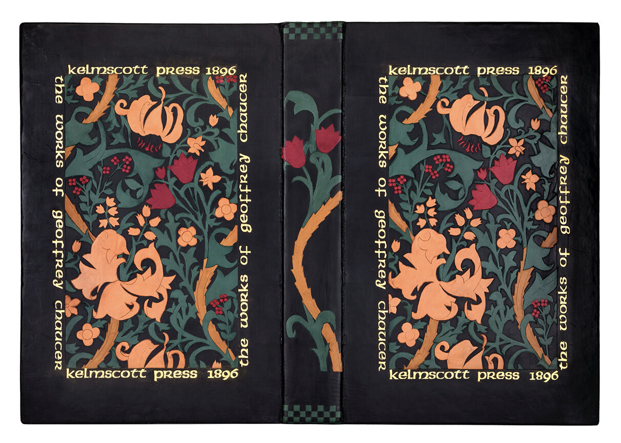

To make life easier for myself while working on the binding design elements, I put together a sling of suede-cloth that would protect the book but allow me to move it about easily. This sling now houses the book about the book that I made up to accompany the binding. The book itself rests in another, more elaborate sling made up from smooth leather. This fits into a box, covered in the William Morris wallpaper that inspired the cover design, constructed a bit like a suitcase, where the handles of the sling slide through openings in the box fore-edge to become the handles of the case.

Which brings me to the topic of…
Binding Big Books
Big Books are big in size, often in weight, in importance, in number of pages, in rarity. But none of these qualities should interfere with their being read. This is the binder’s dilemma. Here are some recent encounters:
The Kelmscott Chaucer was originally bound in blue paper-covered boards with a linen spine and paper title label. It had been sewn on 5 double tapes, the inner tape pasted down between the fist and second (or two last) signatures of the book, the outer tapes sunken into the inside of each board. This attachment was not strong enough to support the weight of the pages, which asked for a more conventional binding where tapes are sunken into the boards from the outside. I used a 5-tape sewing pattern for the binding. The endpapers are made up in the Cobden-Sanderson zigzag format, which adds flexibility to the book’s outside signatures. The handling apparatus for this book is explained above.
I have had the remarkable good fortune to rebind a 4th edition Shakespeare folio and a 2nd folio within a year’s timeframe. Both had been tightly bound in the 19th century, with hollow tube spine and over-sewn outer signatures. Boards were semi-detached on each, and paper was dirty and acid on both.
In the 4th edition volume, the original signature formation had been disrupted for over-sewing. After taking the book apart, washing and de-acidifying it, I reestablished the original signature formation, repaired the pages wherever necessary and resewed the book on raised linen cords appropriate to the publication date of the book. I wanted to create a period-reminiscent binding from a time when there was a paucity of fine English bindings. But I took inspiration from a binding of Allestree’s Lively Oracles, pictured in Hobson’s English Bindings in the Library of J.R. Abbey, and made up a design using small line tools, circle tools and curved line tools, with which I could replicate the flower and acorn tools of the 17th century.

The second folio had been bound in brown cross-hatched calf and was rebacked, using thick, grey craft paper for the endsheets. One page of text was missing.
I had the missing page photographed from a Morgan Library copy, then worked with a printer to create the facsimile printed page to be inserted in the book. The book is rebound in dark brown goatskin with a flat spine. My design derives from a classic fan and wheel binding style, but rather than make up the fan sections and center wheel from small decorative tools, I composed them from the title lettering of various plays. The font is 18 pt.York from Fine Cut Engravers in England, in handle letters so each letter could be tooled separately along the curves of the design. York typeface is comfortably square, without dangling letters, and so lends itself to curved placement. Instead of using a decorative roll on the inside board turn-ins, I used lettering here as well.


_________________
Philip Miller’s The Gardeners Dictionary (London: 1731) and the later published volume 2 are large, heavy books with few illustrations, and those of mechanical devices rather than lovely flowers and plants, but the handsome printer’s devices at the openings and closings of sections worked as my design inspiration. I took two of these devices and used them as cover onlays for the two volumes.

_________________
Also in my gardening library: Parkinson’s Paradisi in Sole (London: Richard Thrale, 1656). Another big book, this one with the plants and flowers illustrated, but somewhat crudely. What is notable in terms of graphics is the title page, a large oval filled with tiny figures of plants and people and animals. This was the inspiration for the oval design of my binding. The large, raised, blind-tooled vase of flowers is an enlarged version of the lower corner-piece design of the title page. To create this, I made a reverse cut-out and pressed it into the leather-covered boards, recessing the background. I used the vase as background for the titling and surrounded it with an oval. The oval is decorated by randomly placed, onlaid, gold-tooled flowers, all traced from illustrations in the book. Since the covers are both titled, I used only flowers on the spine of the book.

Then when it came time to make a box, I had the remnant of the vase impression from the book, which was the image of the vase itself, worked in dark red leather. (I had originally thought to make this onlay the centerpiece of the book, but decided for subtlety instead.) Again, because the title is on the box cover, I felt free to use just a flower on the spine.

_________________

James Joyce’s Ulysses (Paris: 1922), copy No. 6, came to me in a brittle, mustard-yellow calfskin binding; pages were uneven in width and badly stained. I realized that the page signatures were unevenly folded, so that half the pages were too wide, half too narrow, and the center gutters correspondingly uneven. I washed and deacified the book, then refolded each signature to even out the width of the pages and center the folds. The book is now bound in black Harmatan goatskin.
The cover design combines Greek-vase elements with Celtic knots. The overall design evolved in the course of working it. Originally, I had thought to have the Odysseus figure on the book; but in the end Joyce (Bloom) is on the book, Odysseus is on the box, which became an echo of the book design.
The book’s corner-pieces fit into indented spaces in the boards of the book so that they lie flush with the cover leather on top of the black leather. The knot circle was cut from very thinly pared leather, then pasted onto the covers. The Joyce figure is an onlay which I tooled before applying to the book (as I did for the Odysseus figure on the box as well). The corner-pieces were gold-tooled after they had been pasted onto the covers and the spine of the book. The circular titling on the covers was worked with individual handle letters. Endpapers are Payhembury handmade; headbands are handsewn gold and black silk.

The box is covered in black Irish linen, with black leather onlays, blind and gold-tooled for a border, titling. The figure of Odysseus is a terra-cotta-dyed leather, gold-tooled onlay. The box is lined in terra-cotta colored paper and black Ultrasuede.

_________________
There is a continuum in my bookbinding methods. The handle letters I bought for the Shakespeare folio are re-used in the titling of the Ulysses. The technique I developed for the little flower onlays in Paradisi was the rehearsal for the figures on Ulysses. The onlaid, untooled cartouches of The Gardeners Dictionary taught me how to apply the central knot onlay for Ulysses.